Get to Know Us
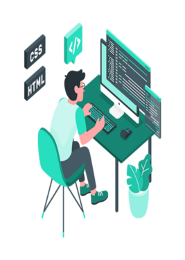
Responsive Web Design Seamlessly Engage Users Across All Devices
This heading emphasizes the importance of responsive design in creating a seamless and engaging user experience across various devices. It highlights the value of ensuring that websites are accessible and visually appealing on desktops, tablets, and smartphones.
Adapt and Thrive: Unlock Your Website's Potential with Responsive Design
This heading communicates the benefits of responsive design by suggesting that it enables websites to adapt and thrive in the ever-changing digital landscape. It implies that responsive design is essential for businesses looking to stay relevant and succeed online.
Remember, the main heading should capture the essence of your responsive website design service, showcasing its ability to provide optimal user experiences across different devices. Feel free to customize these examples to better align with your specific services and target audience.
Our Speciality
Become a Eternity Play Now
Responsive websites use a flexible grid system that adjusts and adapts to different screen sizes. The layout and elements of the website are proportionally scaled based on the screen width, ensuring proper alignment and readability.
Media queries are CSS techniques used to apply different styles and layout rules based on the characteristics of the device or screen size. By using media queries, responsive websites can adapt the design, font sizes, image sizes, and overall styling to provide an optimized experience.
Responsive websites should prioritize performance to ensure fast loading times, particularly on mobile devices. Techniques such as optimizing images, minifying CSS and JavaScript files, and implementing lazy loading of content can significantly improve performance and reduce page load times.
Responsive design should take into account accessibility guidelines to ensure that the website is usable and accessible to people with disabilities. This includes considering factors such as color contrast, text size, alternative text for images, and keyboard navigation.
Our Speciality
Suite Of Services

Necessity
we give a solution for existing as well as new mobile-friendly websites.

Concept
Responsive Web Design should automatically adjust like a responsive architecture.

Search Engine Optimization
Websites are much easier for users to read and navigate.

Advantage
Optimize the content of your website.
Media Queries
consider screen resolution and browser size.